Typograffiti [taɪp əʊ græˈfiːti]

Welcome to 2017, where graffiti is embraced, Banksy is a household name and white washed walls are on standby. But despite this, there is still a slight taboo surrounding the art form. Even today, disapproving comments can be heard from passersby, but are arguably drowned out by the volume of comments on social media, with thousands of posts flooding through each day on Instagram alone.
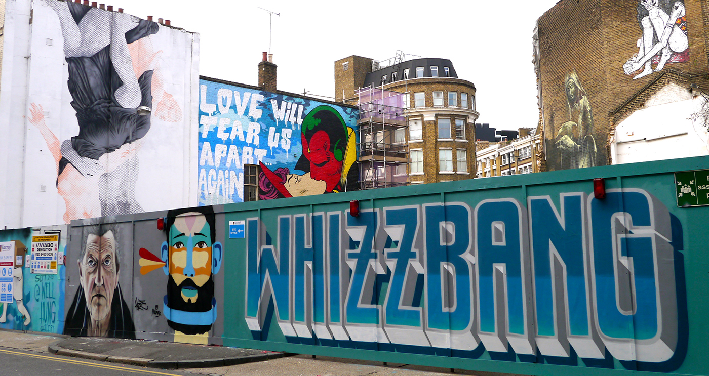
Gone are the days where graffiti was solely associated with illegible ‘tags’, spray painted onto any blank wall by groups of high school drop outs, not one with an ounce of creativity. Now more commonly referred to as street art - we are visually spoilt by urban areas like Shoreditch, where the talents and distinctive styles of artists such as Steve Powers, Ben Eine and Kid Acne are rife. But what do they all have in common? The power of typography.

‘Street typography’ first made its appearance over 100 years ago, from hand painted signs and market stalls, to theatre facades and billboard advertising. Large, bold lettering enticed wondering eyes, instilling marketing messages from just the quickest glance. This impact is mimicked by urban art today. Take Ben Eine’s ‘Alphabet Street’ for example. A London high street, shutters emblazoned with each of the 26 letters in an iconic Eine font. The urge to get a glimpse of each one is overwhelming, not to mention inevitably making a b-line for the shutter with your initial to snap a picture… (Come on, you know you would!). With no two shutters the same, they all individually have their own charm. The font, colour and bold shadowing are all contributing factors as to why this piece is so effective.

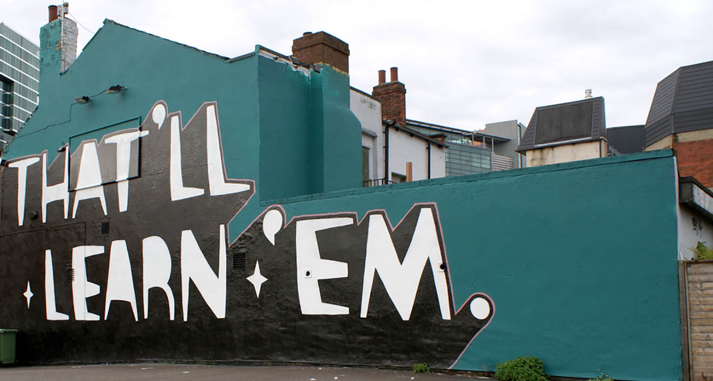
When choosing fonts and colour palettes in typography, it is important to consider the purpose, audience and the level of impact you want to achieve. Street art commonly boasts heavy outlines and solid shadows, allowing it to stand out amongst its forever changing, busy backdrop. This technique is cemented in Kid Acne’s work. By combining a monochrome palette with a single accent colour and utilising a consistent font style, the artwork is unmistakable. The bold black shadow allows the white text to ‘pop’, whilst the accent colour injects a little softness. No frills, it's just a case of dotting the ‘I's and crossing the ‘t’s. A perfect example of simple, yet effective.

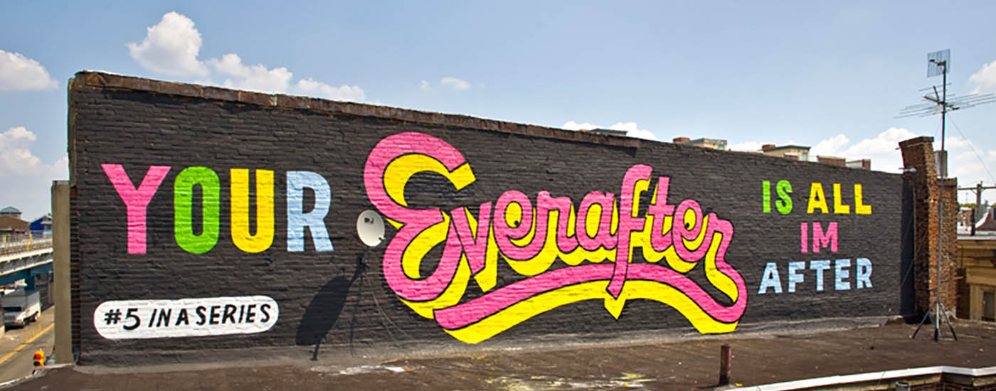
As a juxtaposition, Stephen Powers often uses a selection of different typefaces within one piece of art - a great way of emphasising specific words within a sentence or phrase. Often, the more decorative a typeface, the more difficult it can be to read, so is usually best practice to use for singular words. Better impact all round. Although, no matter which of the above techniques are used, they all equally have the same level of impact when used well.

So, with street art now ubiquitous around inner cities and slowly shaking off its connotations with vandalism, there are thousands of street artists out there, subliminally influencing the art and design world, one spray can at a time. Some even insist on being referred to as just ‘artists’ (or in this case, you could say trailblazers…).
Be sure to explore the wonderful world of street art and the many ways in which it can positively influence all aspects of typography. Oh, and as for Alphabet Street - it is more commonly known as Middlesex Street. Precious time spent Googling saved right there. No need to thank us.
Graffiti.
Art or vandalism? It’s obvious, right?


 RJDM Studios

 Animation Home

 Online Home

 Apps Home

 E-learning Home


 SHARE
SHARE SHARE
SHARE SHARE
SHARE +44 (0)1604 648 464
 info@rjdm.com