


 Animation Home

 Online Home

 Apps Home

 E-learning Home


Colour That Pack A Punch
Colour has a huge importance. It is something that artists and designers work with everyday and is integral to every piece of design work. Whether it is the basis of creating a whole new brand identity, or creating a colour palette to compliment an existing logo.
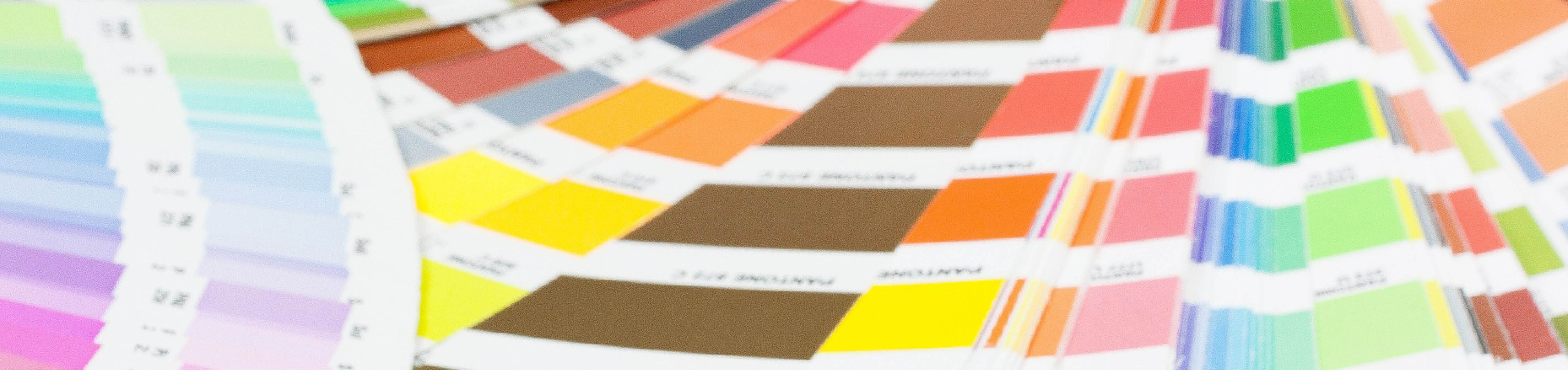
Colour isn’t just about the shades you see in a pack of Crayola crayons. It’s so much more. The human eye can see around 1000 levels of light to dark, 100 levels of red to green, and 100 levels of yellow to blue. This would make the total number of visible colours around 10 million.
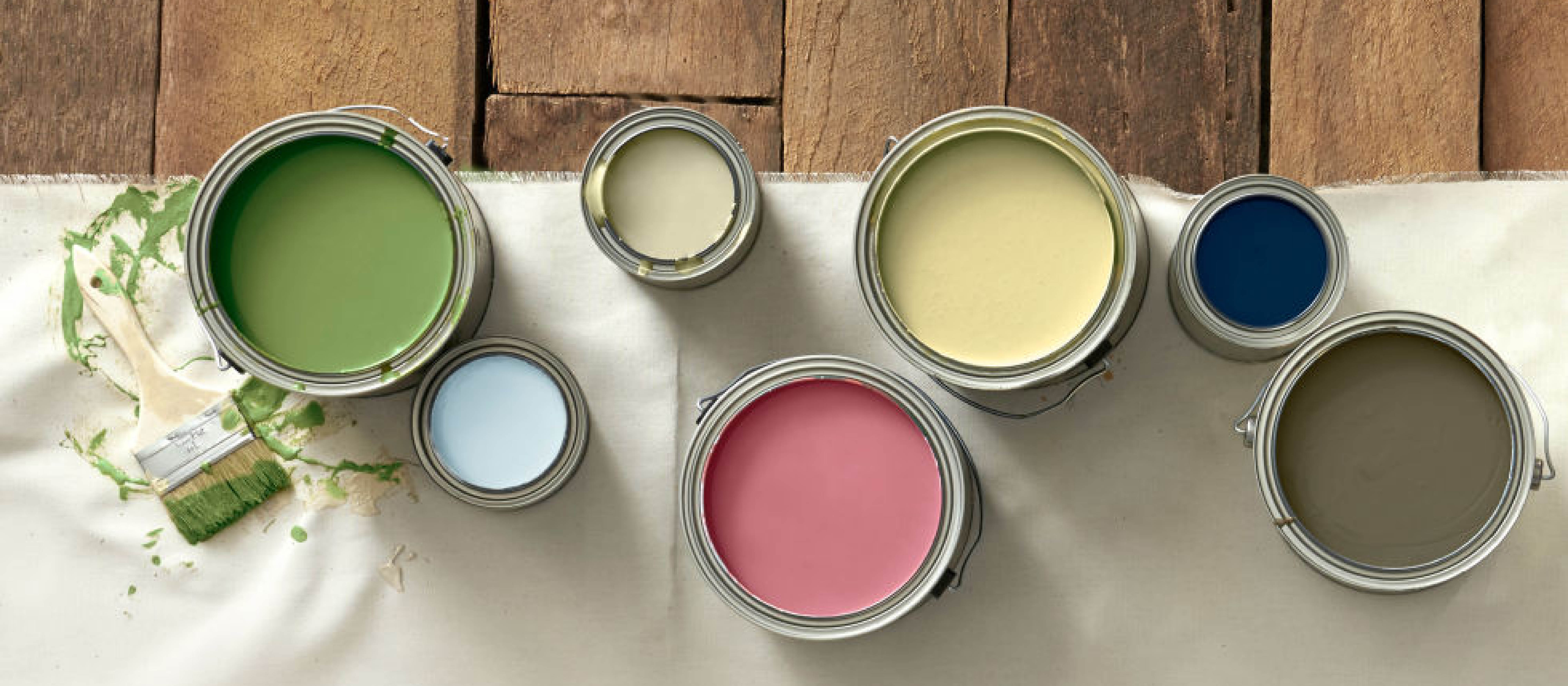
Cat’s Paw, Mole’s Breath, Cooking Apple Green, Drop Cloth. Sound familiar? For any avid interior design lovers reading this, you may recognise them as shades paint from a brand known as Farrow and Ball. If not, the names may have bought a few interesting colours to mind. Colours that have been given an interesting name have been proven to influence someone’s perception of it vastly. Research shows that when shown the exact same colour, but labelled with different names, the more descriptively named swatch was chosen as the preferred colour. No one wants ‘Brown’ when you can have ‘Gingerbread’!
But, colour isn’t just down to choosing the colour of your kitchen walls. Colour is emotive. Let’s take the colour blue for example. Researchers have found that this colour is not only calming, but when used effectively in a workspace, can encourage employees to explore creative solutions. Red on the other hand has been found to induce rage and anger, the complete opposite effect to blue. Interestingly, green has been proven that when shown to participants of a creative task, they performed better and more efficiently.
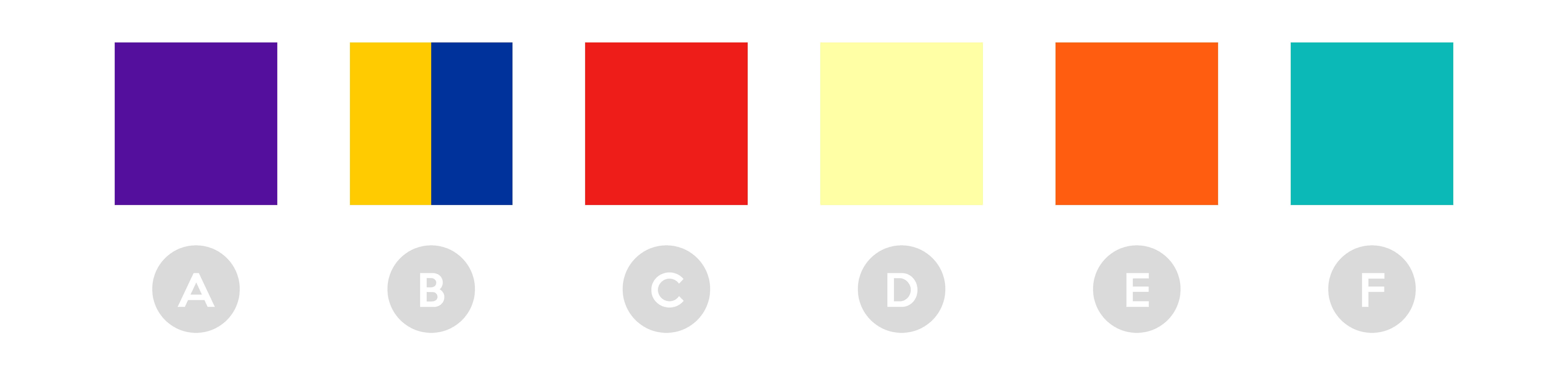
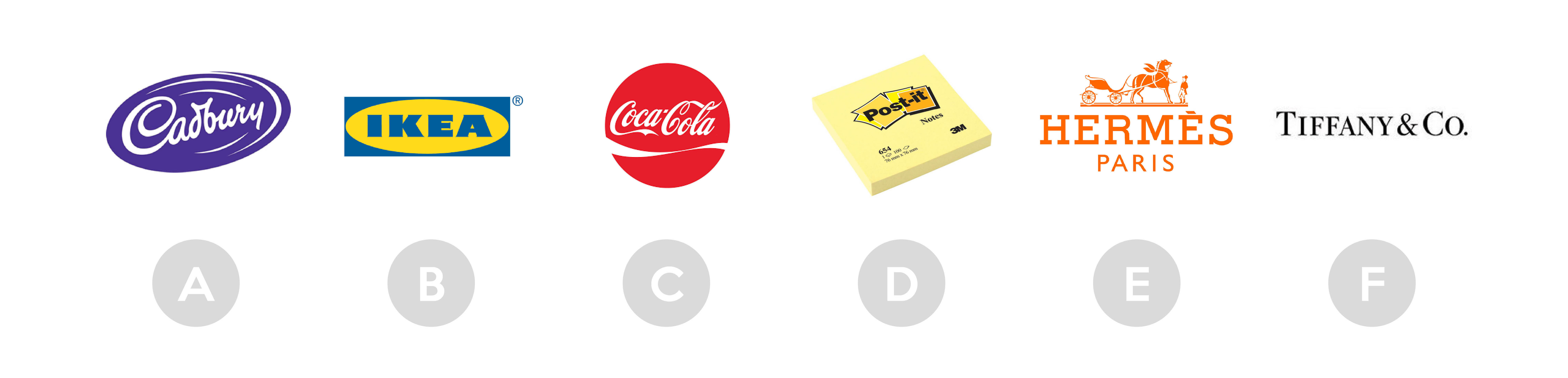
So, how does this relate to the world of business? A study carried out by the University of Loyola Maryland, found that colour increases brand recognition by up to 80%. Not convinced? Why not test your brand colour knowledge? Take a look at the 6 colour swatches below. From A to F, make a mental note of the brand relevant to each of the colours, then keep scrolling to the bottom of the page to see if you were correct!
Applying the notion of colour psychology further into the consumer market, it’s key for grabbing attention and setting yourself apart from your competitors. 55% of customers are more likely to pick up a piece of coloured direct mail first, with most taking only 2.5 seconds to decide if they would like to read or reject it.
Other statistics found that 84.7% of consumers think colour is one of the most important factors when choosing a product. I’m sure you’ll all remember that time you wish something was available in a different colour. It’s quite often you here ‘I wish they had it in a different colour’ from across the store whilst out shopping…
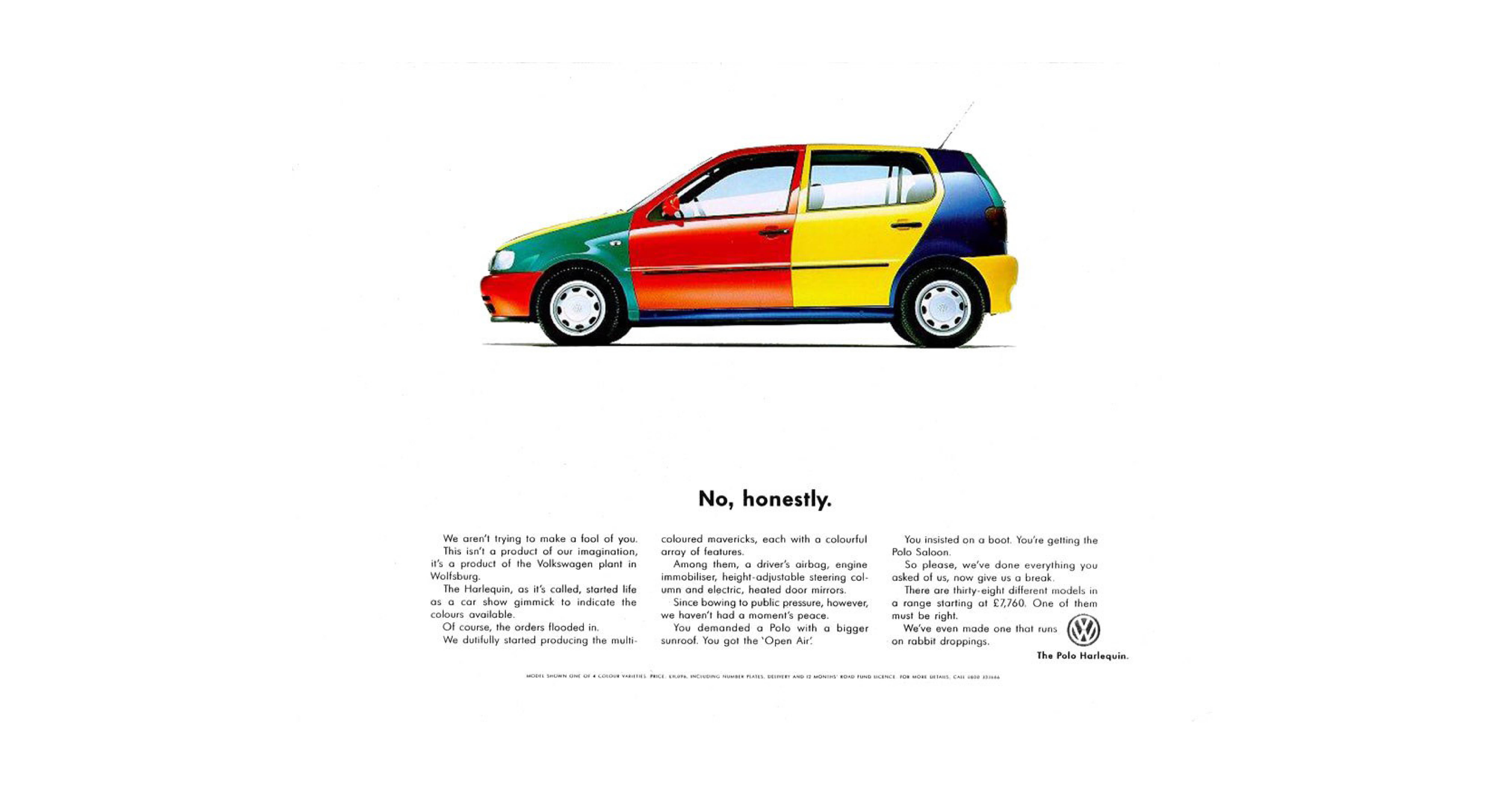
But this is where colour can also throw you in a different direction. Big brands have been releasing limited or special edition colour variants for quite some time now, and with maximum effect! Going back to 1995. Remember the Volkswagen Polo Harlequin? Originally only produced to showcase the colours the vehicle was available in, the Harlequin (by popular demand) was released as special edition and available to purchase. Originally, VW intended on only building 1,000 examples. However, due to the buzz and high demand, Volkswagen sold around four times more as a result. A perfect example of how colour can influence decisions.
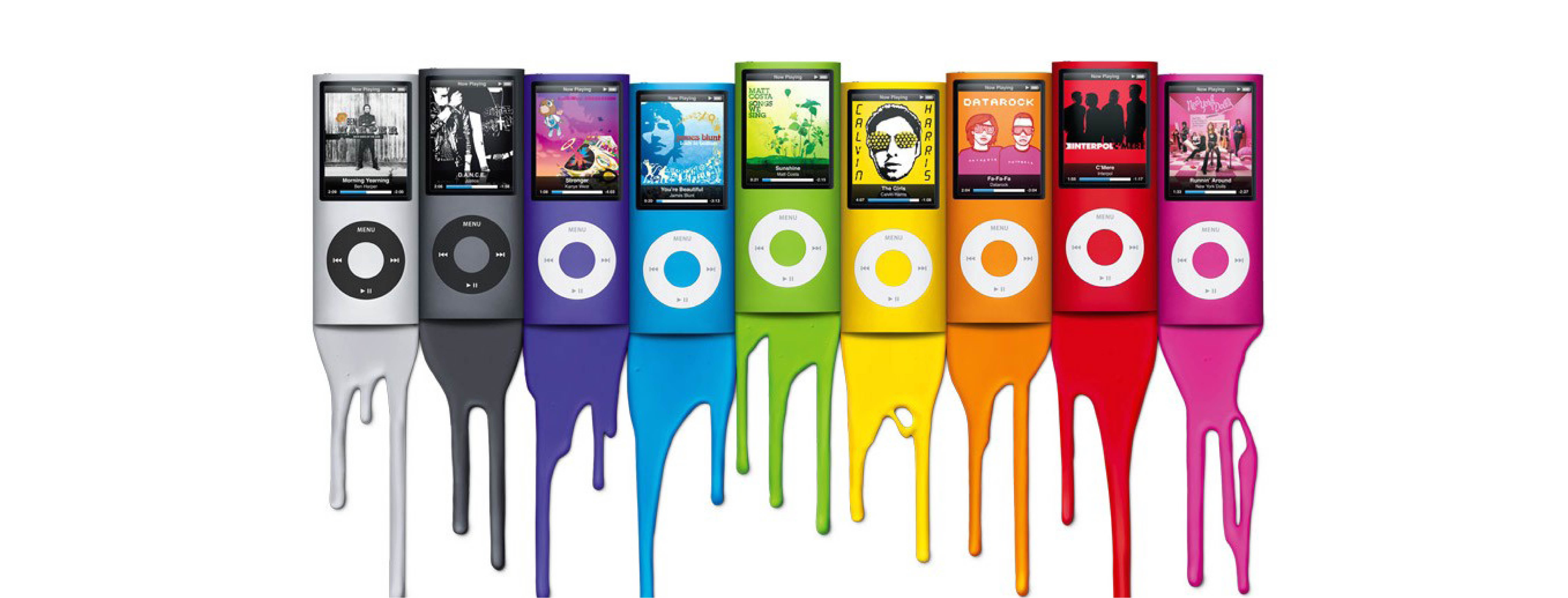
You may even remember the limited edition bottles of Heinz Tomato ketchup. In America, a green ketchup was released, selling over 10 million bottles in just seven months. Generating an estimated $23 million in sales. Apple also chose to use colour to boost sales, with their range of groundbreaking iMacs. Consumers had only ever known computers to be an array of dingy neutral colours. But by releasing a suite of colourful new machines, Apple’s profits rocketed from $44 million to $152 million. And they didn’t stop there either. Over the years we have seen colourful and limited edition iPods, and most recently, the Product Red iPhone 6.
As a juxtaposition, examples of where there is an absence of colour. Take the 2017 Skittles campaign for example, by changing their packaging and product to black and white, they sacrificed their iconic rainbow branding for the duration of Gay Pride to show their support.
It’s all about doing something different, by changing something so small. Admittedly, it is gimmicky, but there is unmistakably a huge demand for it.
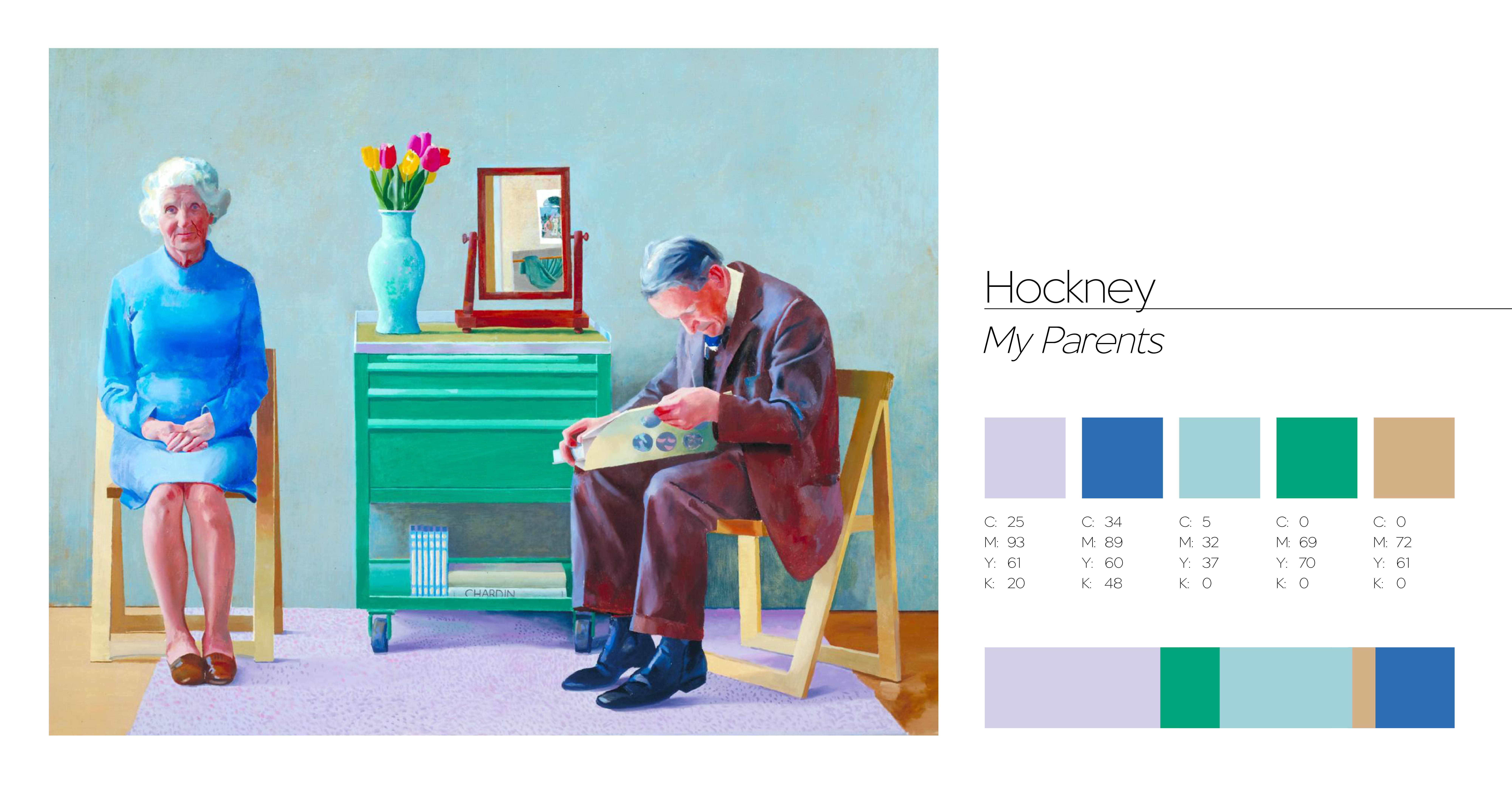
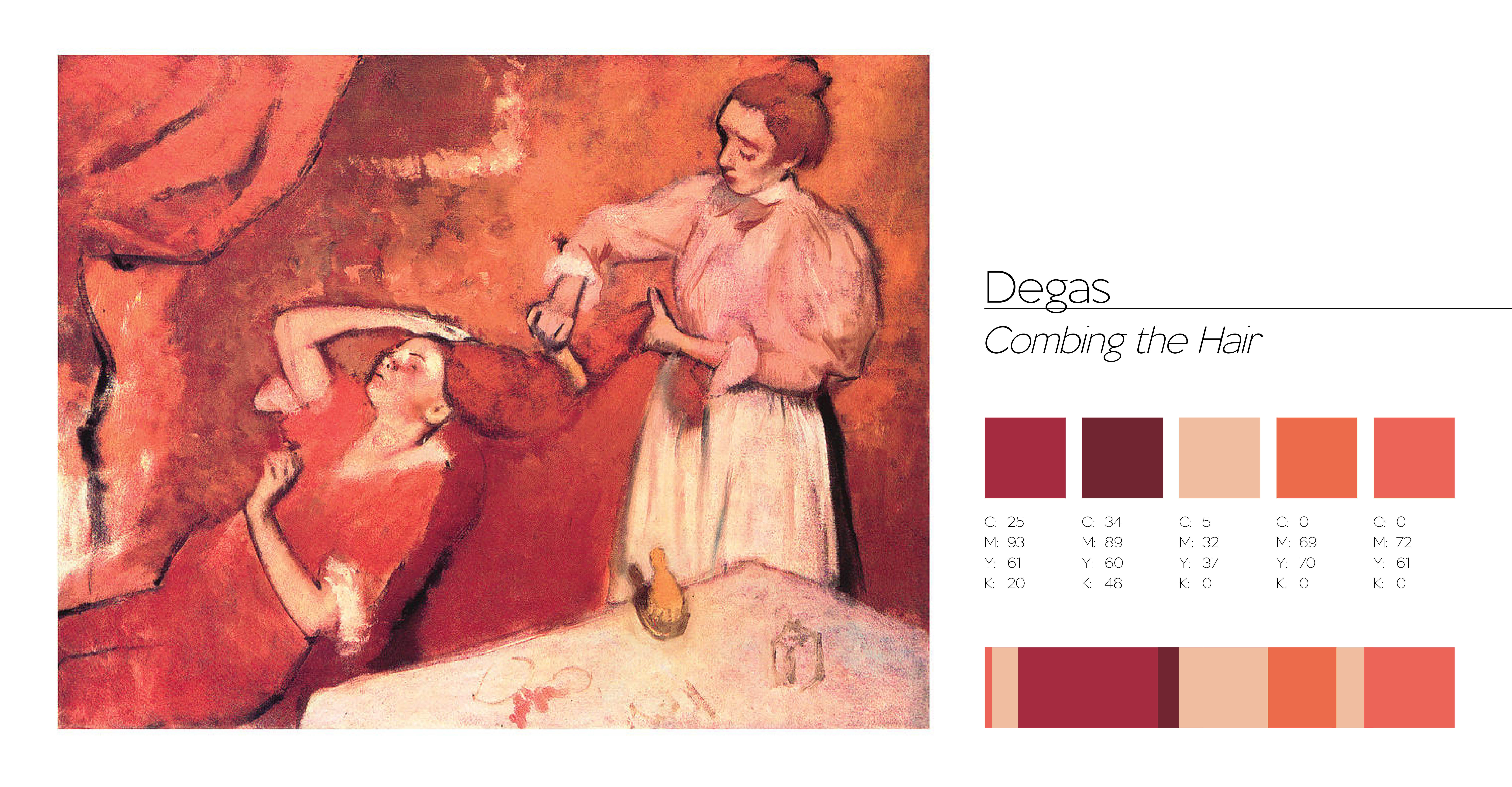
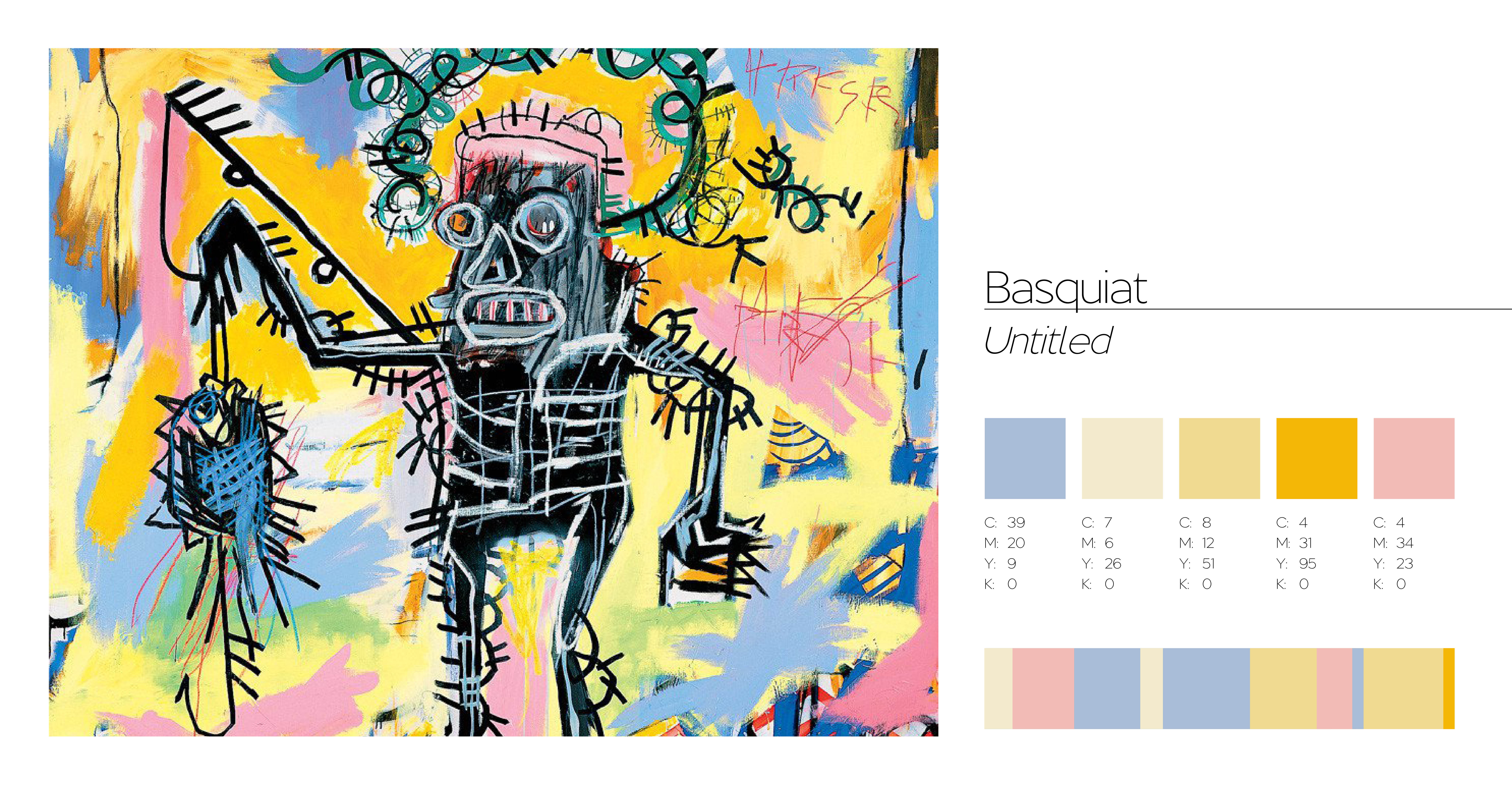
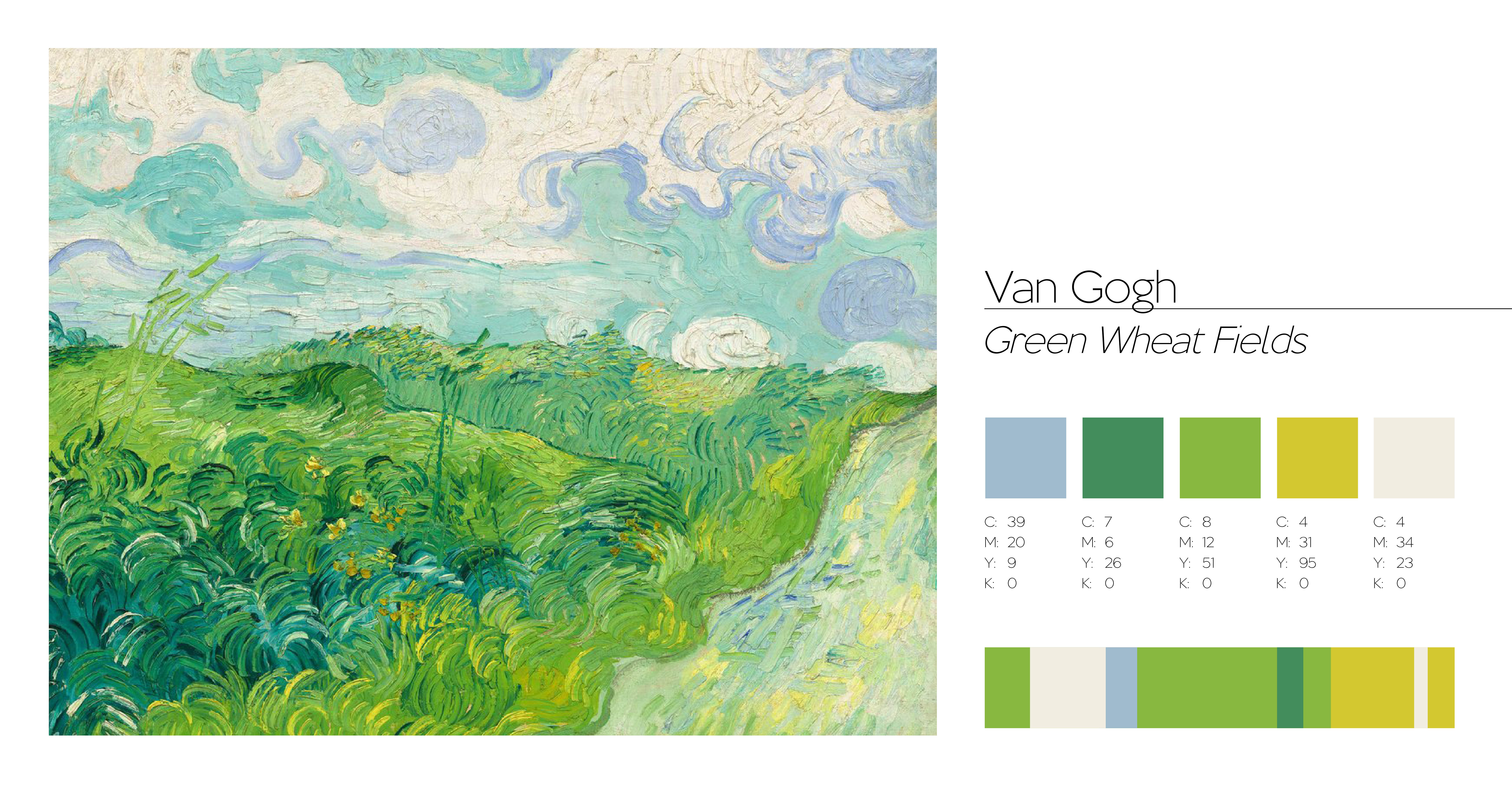
But we must never forget that aside from using colour to influence people’s behaviour and emotions, it is a beautiful thing. It is what makes an artist’s masterpiece and influences the design world today. Take a look at a few of the colour palettes below created by some of the most influential artists to date.
Hopefully now you won’t just take colour for granted. You’ll stop to think if it has a meaning, why it has been used, or even just at how beautiful it looks. But, we will leave you with this. If you’ve ever wondered how you would describe colour to a blind person, let these children give you some tips…
Answers!
And as for the brand colour quiz, let’s see if you’re right, shall we?! A: Cadbury Purple, B: IKEA’s Blue and Yellow, C: Coca-Cola Red, D: Post-It Canary Yellow, E: Hermes Orange, F: Tiffany Blue.
 +44 (0)1604 648 464
 info@rjdm.com
 @rjdmstudios